Category Archives: Web

Using Media Queries

  1. What is a breakpoint? A break point is the window/device size at which a fluid the page as it collapses no longer looks good.

    How can you find them? By resizing the window of the page either physically or using a tool like resizer.

    What do you use them for? When you identify these points you can then begin to adjust the CSS to resize fonts and distribute the page

  2. What tools/resources have you found to help you with finding breakpoints? Resizer

  3. What is that cool thing Chris did with adding text content only at certain screen sizes? He used the CSS pseudo element “content”.

    What code was used and what are a couple of situation that you can imagine where you could do something like that?
    @media all and (max-width: 1000px) and (mid-width: 700px) {
    content: “Text that will be displayed ”; }

    This can be used to display text or a graphic using CSS instead of having to change the HTML at different screen sizes.

  1. How do media queries work? With media queries you can tell the browser what to do if the browser window is narrower or wider. 

  2. Find an article on media queries that you find informative on best practices for media queries and be ready to share it. What did you find useful about the article? The article had great tips particularly about using Sass to keep track of break points.


The article should answer one or more of these kinds of questions:


  • Where do you place media queries? You can place them in separate style sheets based on the media size and then link the style sheet(s) to the HTML page OR you can add the media queries at the end of the main style sheet
  •  How many media queries should you have? Keep it simple. Don’t go overboard. Focus on the main break points.
  • How can you find breakpoints? Let content determine this.
  • How do you know what needs to change at smaller sizes? If text is too small or layout looks bad at a smaller size, you know you need to make adjustments.
  • What are innovative uses for media queries? Showing /Hiding the main menu
    Cool tricks? Adding content using the pseudo element “content”. Things you’d never have thought of using them for? Something called conditional loading.
  • Post a link to a site you’ve worked on that uses media queries, if you’ve done one:
 

HTML5 Boilerplate

April 29 — HTML5 Boilerplate Chat

What does the HTML5 Boilerplate do for you? Boilerplate helps designers to get started with the new standard by offering a professional front-end template that allows you to create a fast, robust and adaptable site with a set of HTML5-ready features and elements.

Why would you want to use a boilerplate? It’s a good starting point. It’s HTML 5 ready but perfect for cross browser sites that work in older browsers.

Go to the 2nd and 3rd links I listed. What features does the boilerplate offer?

  • It features a lean mobile friendly HTML template, optimized Google Analytics snippet; placeholder touch-device icon; and docs covering dozens of extra tips and tricks.
  • It includes a guide to the default HTML, CSS and JavaScript as well as Apache settings for optimum site performance and crossdomain.xml (an intro to making use of crossdomain requests).
  • It also includes Normalize.css v1 — a modern, HTML5-ready alternative to CSS resets  and jquery and modernizer.

What is Modernizr for? It  is a JavaScript library that detects HTML5 and CSS3 features in the user’s browser

What do you think about the sites shown in the showcase? Some are better than others. 

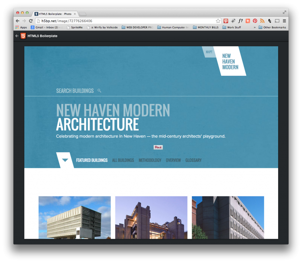
What is a site that you might like to emulate or draw inspiration from there? New Haven Modern Architecture stood out to me because the design is clean, uncomplicated, and is structured much like a building with strong lines. The blue background on the home page emulates the blue sky in the featured images. There is some slight animation transitions on the home page but it is not over the top. The smooth transitions are a feature of HTML5

HTML5 Bollerplate-New Haven Modern Architecture Website

HTML5 Bollerplate- New Haven Modern Architecture Website

 What are some good/interesting things about Initializr? It includes <div> classes for header, main and footer containers, HTML 5 tags for article, header, section, footer and aside (the side bar). Jquery scripts at the end.

What might you use the HTML5 Boilerplate for? Just to give it a shot and see how it compares with the 1140 grid which is what I’ve been using.

How might your use the HTML5 Boilerplate in designing for WordPress? Not really sure but I might look for templates that are built with Boilerplate to see how they are structured.

Contributing to WordPress

April 6 & 8 — Contributing to WordPress

What are some areas listed on the first article that you think are the best ways for you to contribute?

  • User Experience (UI)- This is the area that interests me the most. They do usability tests and point out areas that are confusing or not working. Currently there is a usability test on the image gallery and on the front end editor.
  • WP Core- You can write code, fix bugs, debate decisions, and help with development.
    • “Good first bugs” for new contributors
    • Patches that need testing

Dig deeper into a couple of these areas. What process would it take to contribute? I don’t feel I know enough programming to fix anything. That being said though, I can certainly identify things in a plugin that aren’t working correctly or point out aspects of WP or particular plugins that are not user friendly and make suggestions as to how they could work better.

Why would it be beneficial for you to contribute to WordPress? Taking part in the process always gives you as an individual a little more ownership but it also keeps you as a designer/developer in the “know” so to speak. For example, if you know a particular plug-in has a known issue than you are less likely to try to use it. You can also keep up with the latest trends and fixes.

Here are a couple of interesting articles I found about contributing to Word Press:

Contributing to WordPress in Your Native Language

Why You Shouldn’t Be Worried About Screwing Up When Contributing To WordPress

Pixlfest and Stand Ups

What are some interesting points from the first article that intrigue you?
“Hackathons”… “coding” for a better world is a great idea. When you help others by giving back through time and talent, you help make the world a better place. A good deed has it’s own rewards.

Failing forward—try, fail, learn something and move forward. This is great advice not just as professionals but also as a general rule for living. 

The second article details a technique used in many developer environments. What do you think are the benefits of such a technique? Stand-up meetings are an interesting concept. I agree that the act of standing up can promote shorter meetings just because no one wants to stand for two hours. I wish the article would have been written in the same spirit of brevity.

How do you think we might implement this technique in our online class? I think the online chats are somewhat like a standup meeting. It’s usually one or two topics and our time is 15 minutes.

How do you feel about having more team projects in the online class? Group projects are great but their success or failure really depends on the group. As with anything, some groups have a great dynamic, work well together and are able to get the job done. Others, not so much. I enjoyed the team collaboration. I learned a lot from the experience mostly about the areas I was lacking. If you were to add more group projects, the scope of the projects should probably be smaller than for example the ecommerce site my group worked on.

Do you think as a brand new beginning student that it might be helpful to work on a team to get a site completed? Why or why not? I think a new student might feel a bit overwhelmed, lost and ultimately frustrated. Perhaps after getting a basic understanding of HTML and CSS then maybe a group site might be feasible. Otherwise it might be the blind leading the blind.


If you got to go to Pixlfest, what did you learn that I didn’t touch on in my post? Unfortunately, I did not get the opportunity  to go.


Type Makes a Difference

What are the 10 best takeaways from the first article that you’d like to remember?

  • Type style, texture, tone, general appearance and layout can play a part in whether the user takes interest in a site or not
  • Size matters. If the text that is too small, not one is going to read it.
  • Contrast is important to break the monotony of page. Create contrast with different weights (bold/regular), color, scale, typefaces, texture
  • Use a grid to create structure and hierarchy
  • Use typefaces that complement each other.
  • Use typefaces that enhance or support the subject matter. An Art Deco typeface would work well to support a website on that time period such as: www.artdecosociety.org
  • Use scale and weight to create visual hierarchy (headings, subheadings, and copy)


In what ways does “contrast” matter when it comes to designing the type for a website? Contrast in scale, texture and weight help break up a page and helps create emphasis and hierarchy.


What’s your favorite site that was showcased?

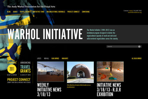
Warhol500_mini

The Warhol Initiative

What does it do well?
Type as Contrast: Uses large type to call your attention to title of the site and (The Warhol Initiative) and through contrast in color and scale, what the site is about.

Minimal Color Palette: limited to black, teal and yellow

Grid Structure: Organizes page neatly

UI Design Guidelines for Responsive Design

What are some tips for tablet design that you want to remember for your future designs?

  • Design for retina display
  • Consider larger font size
  • Since tablets are touch screens, interactive areas should have a larger touch area

What are some tips for smartphones that you want to remember?

  • Minimal content
  • Avoid ads if they are not really needed
  • Get creative with tabs, accordions and navigation to save space
  • Summarize text

Which site in the Showcase section catches your eye? Foodsense Why do you admire it? It is seamless from desktop, tablet to mobile. In terms of what is up front and center, only the most important and relevant elements are present in screen area of the mobile and tablet versions. While the layouts differ slightly, the difference between each seems minimal because the branding is consistent.

What is another article that you can recommend on a related topic?

Feb. 25 — Polish Your Portfolio (So You Can Freelance in School)

Briefly summarize the advice given in the two articles.

The advice is pretty sound and makes marketing common sense:

  • Branding yourself is important. Need a clear logo and tagline.
  • It needs to be easy to navigate
  • Only show your best work! Don’t show everything.
  • Organize in categories that make sense
  • The X factor. Show your uniqueness. What makes you so special?

Choose 2 example portfolios that you like best and discuss the design choices that they made that make it appeal to you.

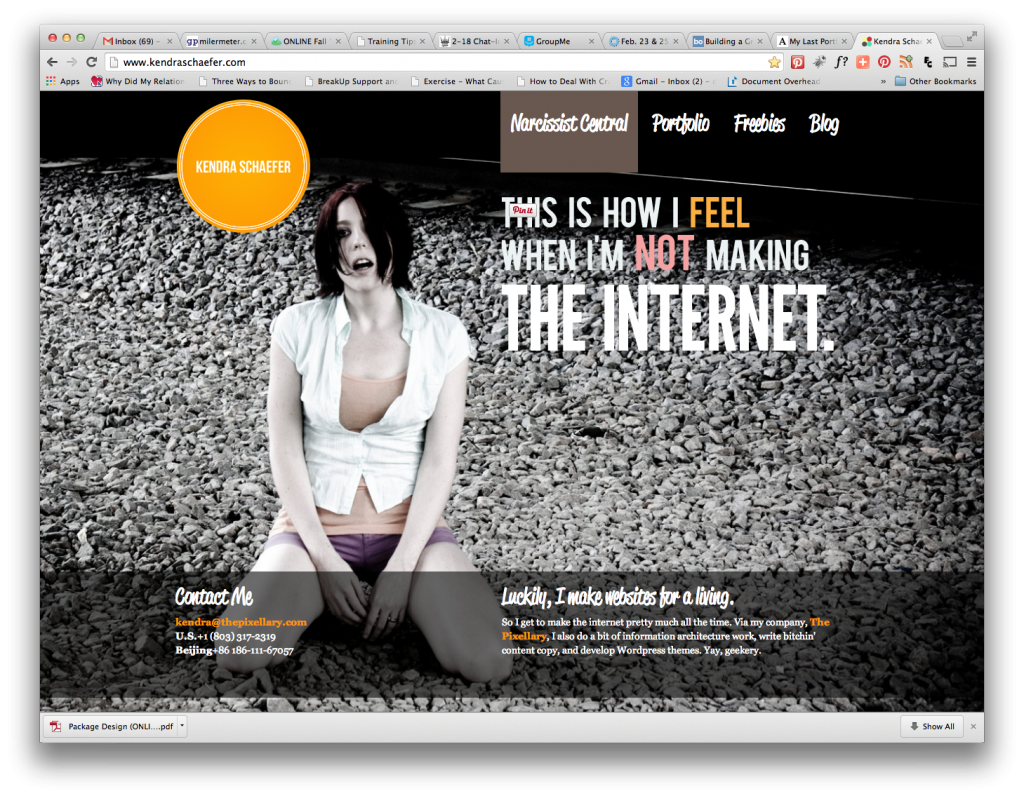
Kendra Shaeffer

Screen Shot 2014-02-25 at 7.12.41 PM

Her site is very unique, hip and has a rock-n-roll style too it. I like how she used a full image background. It’s easy to navigate. Contact info is on the front page. There’s a call to action, “Contact Me”. It also leads you to her company site. http://www.kendraschaefer.com/

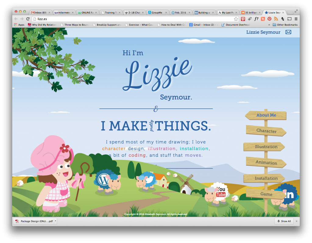
Lizzie Seymour

Screen Shot 2014-02-25 at 7.15.18 PM

Her site is very unique, cute and expresses very well her expertise (illustration). I like the background scrolls and the front is static. It’s easy to navigate. Contact info is on the front page but is only a “envelope” icon indicating email. I think there should be more of a call to action. About me is very short. Categories are straight-forward. Animation, Installation & Game only have one example each. Seems a bit light which makes me wonder about how much experience she has in these areas. http://lizz.es/


  1. Why might you want to redesign your portfolio site while you are still in school? As you move through the program, you will learn new things so it is important to keep your portfolio site updated to reflect new skills, techniques and programs you’ve learned.


2-18 Chat-Inspirational WP Men and Women

Who are the three most inspirational people listed in the two articles and why do you find them so inspiring?

  • Daniel Espinoza -he was able to pay off a huge debt with the money he made from developing plugins
  • Lisa Sabin- left her career and started another career in web design & development
  • Jen Mylo -for her  role of encouraging more women and diversity in the WordPress community.


Explain the significance/meaning of the following terms:

  • Wordcamp– WordCamp is a conference that focuses on everything WordPress.WordCamps are informal, community-organized events that are put together by WordPress users like you. Everyone from casual users to core developers participate, share ideas, and get to know each other.
  • Automattic-links to open source projects such as WordPress.com, VaultPress and Gravatar
  • UX-User Experience
  • Multisite- the WordPress configuration that lets a user launch several sites off their main site. It’s not something that most users may know

What did you learn from reading the articles?

There are a lot of people doing great things to further WordPress and other spin off projects that work with WordPress. I also like to see that there are a lot of women involved in web development. It’s is not just for computer geeks!

Feb. 4 Social Media Sprites and Icon Fonts

What is a sprite or roll-over and how do they work?
A sprite is made up of multiple images in one file (such as social media icons). The trick is in the CSS, which reveals the portion of the overall file that needs to be revealed such as in a rollover. I’ve used sprites for social media icons quite a bit. Once you get it to work, you can reuse it to save time. If icons change, they can be swapped out so long as the size of the icons remain the same.

social-media-icons

Using social media icons as an example, the advantage of sprites to create a rollover effect, is that one file will contain all the icons in the visible and hover state. The rollover is created through CSS by plugging in the coordinates of the icon in the rollover state to reveal it. Hence only one file is called from the server as opposed to each individual icon in its own file, which would have to be called from the server individually. The rollover in this scenario is created through an imageSwap.

What will be the possible benefits of using fonts for your icons? Icon fonts are scalable vector icons that can be customized — size, color, or anything that can be done with CSS. They are great ways of creating more complex CSS transitions with icons – transitions that could not be replicated with images.
What is your favorite trick that he shows in the second article? Personally, I liked the hover effect. It’s pretty standard effect but I prefer something subtle because I wouldn’t want to call too much attention to the effect.

What would you like to use on your own site? Hover

Here’s a great site to help you create a sprite:

www.spritecow.com

Jan. 28 — Flexbox, A New(ish) CSS Feature

What is flexbox? Is a CSS module provides a more efficient way to lay out, align and distribute the space of items inside of a container when you don’t know the size or if the items are dynamic. The container will adjust the dimensions of the contents within it to best fill the available space. Items will either expand or shrink to fill the space.

What will be the possible benefits of using flexbox be? The items inside a flexbox container don’t necessarily have to be resized ahead of time and don’t have to uniform in size. This can be a time saver. Might work well for responsive sites. Instead of trying to make an image responsive, make the container that holds the image a flexbox.

What’s the coolest showcase item on the second website in your opinion and why do you think so? Sticky footer is my favorite. The solutions that exist today depend on knowing the height of the footer in order to work. Trying to get the footer to stay at the bottom with normal CSS is difficult because you have to know the height of the footer. With flexbox, the solution is easy. You wrap the vertical sections in a flex container and then pick the ones you want to expand. By doing this, they take up all the available space thus pushing the footer to stick to the bottom.