Briefly summarize the advice given in the two articles.
The advice is pretty sound and makes marketing common sense:
- Branding yourself is important. Need a clear logo and tagline.
- It needs to be easy to navigate
- Only show your best work! Don’t show everything.
- Organize in categories that make sense
- The X factor. Show your uniqueness. What makes you so special?
Choose 2 example portfolios that you like best and discuss the design choices that they made that make it appeal to you.
Kendra Shaeffer
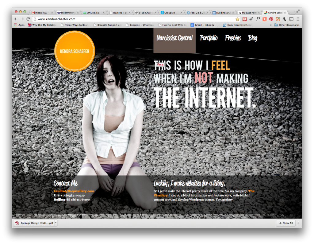
Her site is very unique, hip and has a rock-n-roll style too it. I like how she used a full image background. It’s easy to navigate. Contact info is on the front page. There’s a call to action, “Contact Me”. It also leads you to her company site. http://www.kendraschaefer.com/
Lizzie Seymour
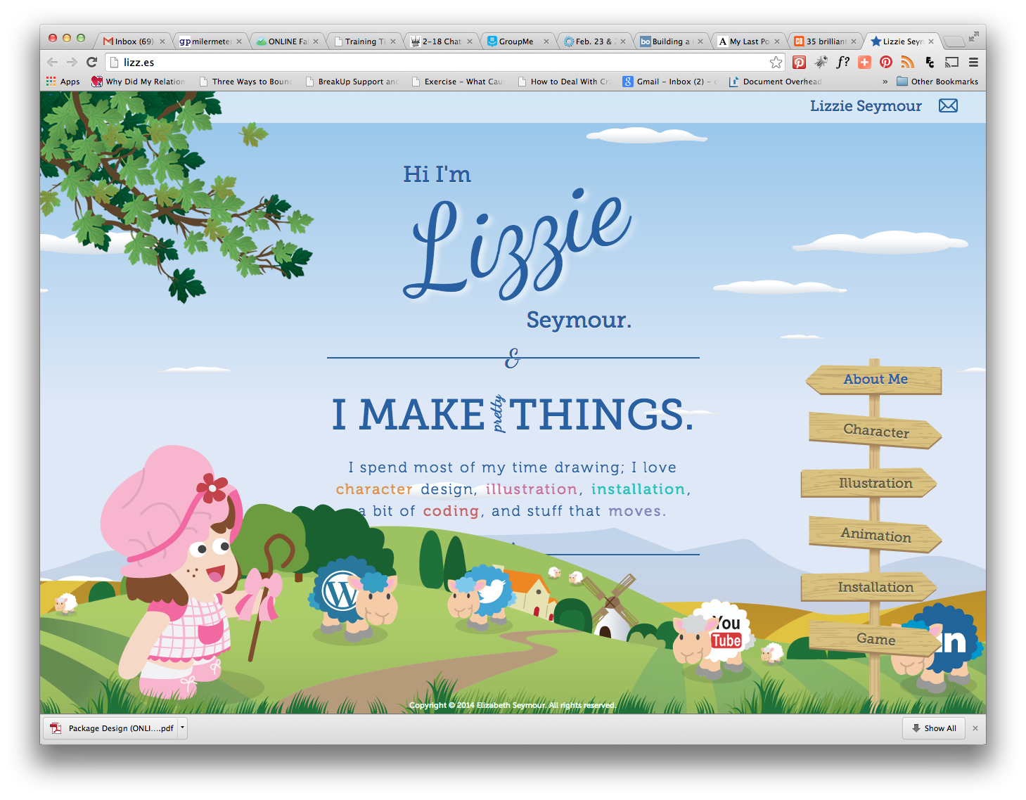
Her site is very unique, cute and expresses very well her expertise (illustration). I like the background scrolls and the front is static. It’s easy to navigate. Contact info is on the front page but is only a “envelope” icon indicating email. I think there should be more of a call to action. About me is very short. Categories are straight-forward. Animation, Installation & Game only have one example each. Seems a bit light which makes me wonder about how much experience she has in these areas. http://lizz.es/
- Why might you want to redesign your portfolio site while you are still in school? As you move through the program, you will learn new things so it is important to keep your portfolio site updated to reflect new skills, techniques and programs you’ve learned.