What are the 10 best takeaways from the first article that you’d like to remember?
- Type style, texture, tone, general appearance and layout can play a part in whether the user takes interest in a site or not
- Size matters. If the text that is too small, not one is going to read it.
- Contrast is important to break the monotony of page. Create contrast with different weights (bold/regular), color, scale, typefaces, texture
- Use a grid to create structure and hierarchy
- Use typefaces that complement each other.
- Use typefaces that enhance or support the subject matter. An Art Deco typeface would work well to support a website on that time period such as: www.artdecosociety.org
- Use scale and weight to create visual hierarchy (headings, subheadings, and copy)
In what ways does “contrast” matter when it comes to designing the type for a website? Contrast in scale, texture and weight help break up a page and helps create emphasis and hierarchy.
What’s your favorite site that was showcased?
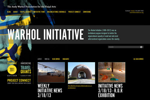
The Warhol Initiative
What does it do well?
Type as Contrast: Uses large type to call your attention to title of the site and (The Warhol Initiative) and through contrast in color and scale, what the site is about.
Minimal Color Palette: limited to black, teal and yellow
Grid Structure: Organizes page neatly