July 15 — Practice Critique #2

Write 1 positive compliment and 2 critical questions/comments, according to the rules/setup you just re-read.

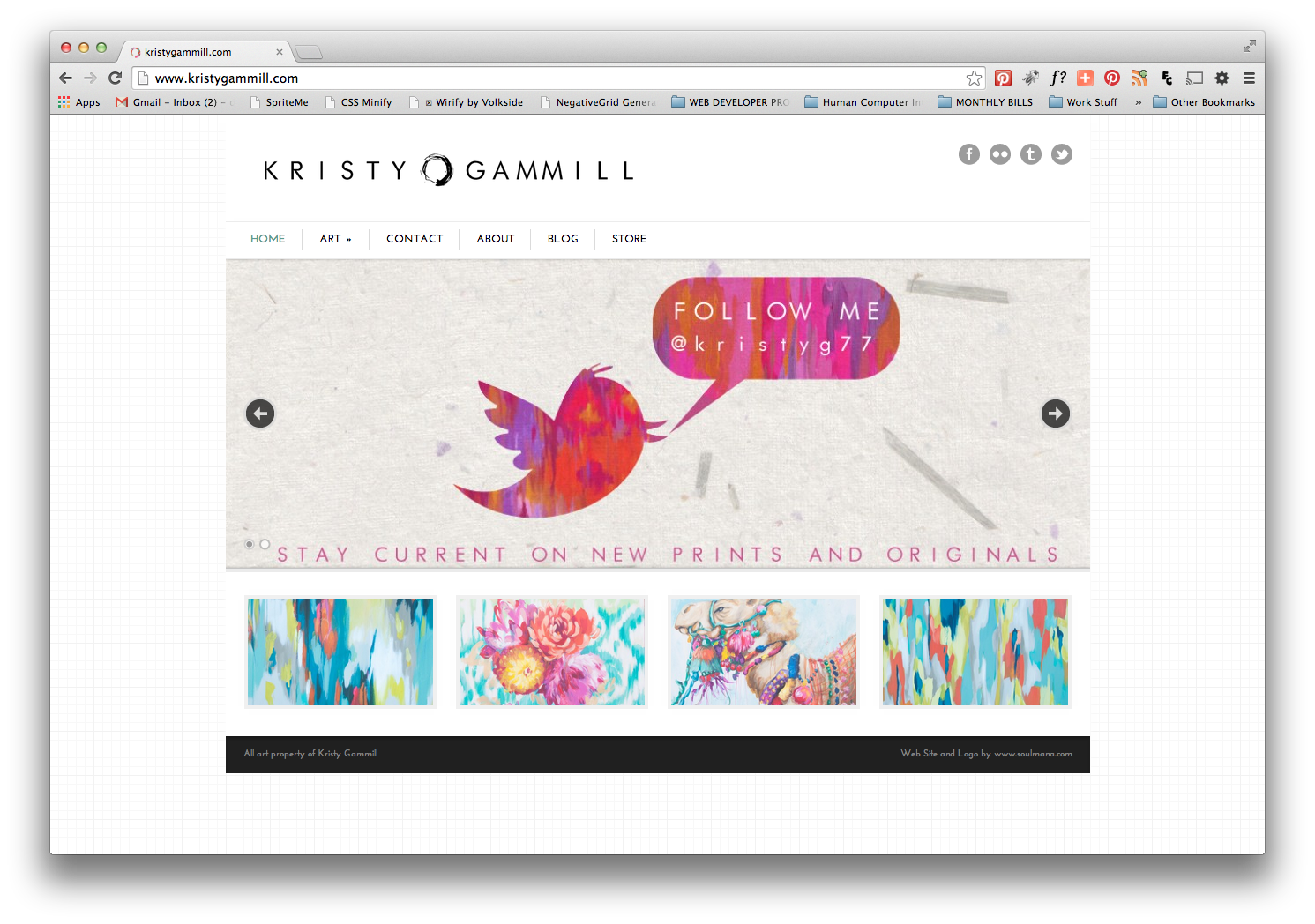
(+) Clean, easy to navigate

(-) Only 2 images in slide show. Need at least 3 to feel like a slide show. Transitions too quickly between the images. Gets old quickly and becomes a distraction. Should always provide a way to turn the slide-show off.

(-) Home page could use some variety. Images of artwork on the bottom are quick links to those pieces but having them seems a bit unnecessary since they could easily be included in the slide show. Or if they are meant to be featured pieces, then adding a label above that section called “Featured Work” would help identify the section and give it some meaning or reason.

(-) The blog link should open in a separate tab or page instead of in the same window. When you click on the logo, in the blog, you expect to return to the homepage of her website, but instead the logo links the blog.

(-) Shop link, also takes you offsite. Whenever possible, mask links to 3rd party sites with your website instead of using a subdomain.

kristy gamill site
kristy gamill site


kristy gamill site critique (click to download PDF)


Take aways from Chat

Is there enough time in a “live” chat format to get enough good info if you are the designer? Yes. With so many people participating, a lot good info can be obtained. Also, it makes it easier to identify areas that need attention if many people bring up the same points.

Was there anything said that would have hurt your feelings if you had been the designer? No

How would you deal with the comments that were made if you were the designer? Even though I may not agree with every comment, I would take everything said into consideration. It is always to separate yourself from your work. My rule of thumb is if I have to over explain a design, then clearly it not communicating the way it should and deserves to be reexamined.

June Chat — “Look and Feel” Critiques

What did you find interesting/important in the Podcast? 

When I’m not a student or running the Creative Department where I work, I teach graphic design to university students and online. I’m quite familiar with critiques and feedback since that comes with the territory. In spite of this experience, I did find the podcast interview with Adam Conner and Aaron Irizarry very interesting and did learn a some things that I hadn’t considered before:

  • There is a difference between critique, feedback and a design review. Feedback is a gut reaction. Critique is more specific and is a dialogue. It focuses on how a design is or isn’t achieving certain goals to help the designer understand the impact of design decision. Design review is about signoff and approval.
  • There 2 sides to a critique- giving and receiving
  • Giving critiques is about trying to understand what the designer was trying to do, how they tried to do it, and if it’s working or maybe if they have more to do to get there.
  • Receiving critique is about understanding the impact of the design decisions that a designer has made so far, and where they should focus efforts going forward.
  • Different types of critiques:

o   Standalone (informal/ impromptu)-getting input from peers to see if the design is headed in the right direction.

o   Collaborative

  • To have a good critiquing session, it is important to establish clear goals
  • After a critique the designer should continue to work on the design giving consideration to the information obtained from the critique
  • Good idea to review goals and objectives before starting a critique session

Do you think suggestions should be allowed? Personally, I think suggestions should be allowed only if the person suggesting gives a specific reason for it:

Suggestion: Changing the background color of a Spa Website from light gray to light green

Reason:  Consider trying a light green background in lieu of gray. While gray is neutral and stable, the color green is often associated with the feeling of freshness and renewal, communicating the spa experience to the intended audience).

 What rules should we agree to abide by in our critiques?

  • Be constructive
  • Be specific
  •  Be respectful and professional at all times
  • Do not be defensive
  • Do not take the critique personally
  • Be prepared to explain your design decisions work.
  • Be prepared to explain your concept


List the questions that you think we should use when we do a Look and Feel Critique.

  •  What is the focal point of the design?
  • Does the design style seem appropriate for the stated goal or purpose?
  • Does the concept match the content and intended audience?
  • Is the site effective in engaging the audience?
  • Is the website’s interface and navigation intuitive and effective?
  • Does the site use hierarchy to organize content?
  • Does the typographical choices reinforce the design theme and aesthetics?
  • Does the typography feel appropriate in tone?
  • Details: Is the use of these particular graphic elements consistent with the goals of the project? Why? Why not?
  • Problem areas: What things in this solution are not as effective as they could be? Why do you think that?
  • Appeal: Is this an effective and appealing design for the context it will live in? Why? Why not?

List the resources/website links that you used to arrive at your list.


June 10 Chat-Codekit

  1. What can Codekit do for you? CodeKit is an app that helps you build websites faster. It compiles all the cutting-edge languages like Sass, Less, Stylus and CoffeeScript. It live-refreshes your browsers. It combines, minifies and syntax-checks JavaScript. It even optimizes images. All stuff that speeds up both your website and your workflow.
  2. How do you feel about using it someday? It seems like a great tool. I would give it a try to see how it works.
  3. What are Grunt and Gulp? Gulp.js is an automated task runner that helps simplify the process of automating repetitive tasks. Is uses Node.js streaming syntax to pass results from one function to the next. This makes it very intuitive and allows you to easily build a workflow that is easy to understand for developers. Grunt is also javascript task runner. It is focused around the configuration of tasks using JavaScript objects.
  4. What can you do with that second link? The negative grid generator is an excellent tool to create your own grid.  How can you use it? It’s as simple as plugging in the numbers and clicking “generate grid”.  CSS for the grid is produced with all the correct percentages.

Chat June 3 Google Hangouts

  1. ]When/how often would we do critiques and code reviews? We should do have formal critiques at least every other week. Maybe we can alternate critiques and chats.
  2. Walk us through a typical critique session. What would that look like? Will we use videos? Video phone calls? How would we leverage Google Hangouts to make this work for us? Would we break into smaller groups? Post a link to the site being critiqued at least a day ahead to give everyone a chance to take a look. I’m not one for video. I prefer written so I would recommend snapshots or Jing with notes.
  1. Are there any ground rules you’d want to establish? Being honest yet constructive is key. Be specific about what works and what doesn’t work. Make suggestions for improvement. How would you learn the best and get the most out of a critique of your own site? I’m a visual learner so I learn by seeing examples.
  1. Would we develop a set of questions or just wing it each time based on what we know, etc.? Having a set of questions to ask or critiquing points would be very helpful. Would the designer begin the session with an intro explaining the goals and challenges? This would be a good idea.


Using Media Queries

  1. What is a breakpoint? A break point is the window/device size at which a fluid the page as it collapses no longer looks good.

    How can you find them? By resizing the window of the page either physically or using a tool like resizer.

    What do you use them for? When you identify these points you can then begin to adjust the CSS to resize fonts and distribute the page

  2. What tools/resources have you found to help you with finding breakpoints? Resizer

  3. What is that cool thing Chris did with adding text content only at certain screen sizes? He used the CSS pseudo element “content”.

    What code was used and what are a couple of situation that you can imagine where you could do something like that?
    @media all and (max-width: 1000px) and (mid-width: 700px) {
    content: “Text that will be displayed ”; }

    This can be used to display text or a graphic using CSS instead of having to change the HTML at different screen sizes.

  1. How do media queries work? With media queries you can tell the browser what to do if the browser window is narrower or wider. 

  2. Find an article on media queries that you find informative on best practices for media queries and be ready to share it. What did you find useful about the article? The article had great tips particularly about using Sass to keep track of break points.


The article should answer one or more of these kinds of questions:


  • Where do you place media queries? You can place them in separate style sheets based on the media size and then link the style sheet(s) to the HTML page OR you can add the media queries at the end of the main style sheet
  •  How many media queries should you have? Keep it simple. Don’t go overboard. Focus on the main break points.
  • How can you find breakpoints? Let content determine this.
  • How do you know what needs to change at smaller sizes? If text is too small or layout looks bad at a smaller size, you know you need to make adjustments.
  • What are innovative uses for media queries? Showing /Hiding the main menu
    Cool tricks? Adding content using the pseudo element “content”. Things you’d never have thought of using them for? Something called conditional loading.
  • Post a link to a site you’ve worked on that uses media queries, if you’ve done one:


Quacks & Year in Review

Quacks & Year in Review

What sites did you hand-code this year?

förnya spa

Muse discography

jacineariasdesign.com

Brewhaha Coffee Shop (1 page Typography)

Stick It In Stones eCommerce site


Which is your favorite? Stick It Stones was a collaboration project with Mike Brooks and Keiana Cross. It is an eCommerce site. We were tasked to take a static site and rebrand and redesign it into an eCommerce site What Quacks could you nominate it for? Responsive, User Experience

Student sites and projects to nominate for Quack Awards:

Keiana Cross-Charista’s Dessert Bar & Fine Chocolate- User Experience

Mike Brooks-Weezer Discography-Responsive & User Experience

Melissa Phillips-Three Six D Digital Productions –Best Portfolio

HTML5 Boilerplate

April 29 — HTML5 Boilerplate Chat

What does the HTML5 Boilerplate do for you? Boilerplate helps designers to get started with the new standard by offering a professional front-end template that allows you to create a fast, robust and adaptable site with a set of HTML5-ready features and elements.

Why would you want to use a boilerplate? It’s a good starting point. It’s HTML 5 ready but perfect for cross browser sites that work in older browsers.

Go to the 2nd and 3rd links I listed. What features does the boilerplate offer?

  • It features a lean mobile friendly HTML template, optimized Google Analytics snippet; placeholder touch-device icon; and docs covering dozens of extra tips and tricks.
  • It includes a guide to the default HTML, CSS and JavaScript as well as Apache settings for optimum site performance and crossdomain.xml (an intro to making use of crossdomain requests).
  • It also includes Normalize.css v1 — a modern, HTML5-ready alternative to CSS resets  and jquery and modernizer.

What is Modernizr for? It  is a JavaScript library that detects HTML5 and CSS3 features in the user’s browser

What do you think about the sites shown in the showcase? Some are better than others. 

What is a site that you might like to emulate or draw inspiration from there? New Haven Modern Architecture stood out to me because the design is clean, uncomplicated, and is structured much like a building with strong lines. The blue background on the home page emulates the blue sky in the featured images. There is some slight animation transitions on the home page but it is not over the top. The smooth transitions are a feature of HTML5

HTML5 Bollerplate-New Haven Modern Architecture Website

HTML5 Bollerplate- New Haven Modern Architecture Website

 What are some good/interesting things about Initializr? It includes <div> classes for header, main and footer containers, HTML 5 tags for article, header, section, footer and aside (the side bar). Jquery scripts at the end.

What might you use the HTML5 Boilerplate for? Just to give it a shot and see how it compares with the 1140 grid which is what I’ve been using.

How might your use the HTML5 Boilerplate in designing for WordPress? Not really sure but I might look for templates that are built with Boilerplate to see how they are structured.

WordPress Essentials Blog

Since this is essentially a review, I decided to use the TwentyFourteen theme used  in the WP Essentials course rather than the Builder themes I had previously installed.

I actually like some of the functionality of the the TwentyFourteen theme. It has a lot more features that can be optimized from the theme customizer than the Builder theme I was using before.

I added the AddThis Share widget which is very handy. It was pretty easy to set up. The only thing I don’t like or couldn’t figure out is how to add the widget to the actual blog page. The widget only shows on the individual post page.

There are a few aspects of the layout that I wish could be edited from the customizer, such as header image location. It would be nice if you could choose whether the image can appear above or below the main menu.

I will continue to play with different themes and will likely go into the css to experiment with layout and design.

Contributing to WordPress

April 6 & 8 — Contributing to WordPress

What are some areas listed on the first article that you think are the best ways for you to contribute?

  • User Experience (UI)- This is the area that interests me the most. They do usability tests and point out areas that are confusing or not working. Currently there is a usability test on the image gallery and on the front end editor.
  • WP Core- You can write code, fix bugs, debate decisions, and help with development.
    • “Good first bugs” for new contributors
    • Patches that need testing

Dig deeper into a couple of these areas. What process would it take to contribute? I don’t feel I know enough programming to fix anything. That being said though, I can certainly identify things in a plugin that aren’t working correctly or point out aspects of WP or particular plugins that are not user friendly and make suggestions as to how they could work better.

Why would it be beneficial for you to contribute to WordPress? Taking part in the process always gives you as an individual a little more ownership but it also keeps you as a designer/developer in the “know” so to speak. For example, if you know a particular plug-in has a known issue than you are less likely to try to use it. You can also keep up with the latest trends and fixes.

Here are a couple of interesting articles I found about contributing to Word Press:

Contributing to WordPress in Your Native Language

Why You Shouldn’t Be Worried About Screwing Up When Contributing To WordPress

Individual Theory of Aesthetics & Design (WP Essentials Test Post)

My Individual Theory of Aesthetics and Design (ITAD) has been influenced by my childhood, education, work experience, conferences I’ve attended, research from design books and magazines I’ve collected and searching on the internet.

Childhood

I come from a creative family on both sides but I would have to say that my mom was a huge influence creatively speaking. Being an extremely creative person herself, she was a jack-of-all-creative-trades from macramé to needle point, she tried it all and I loved to learn. As a result I loved to make things; needle point, basket weaving, making latch hook rugs, knitting and macramé. This love of making things included designing and producing my own activity books, which my mom sewed together.

 [Creativity lies within but needs to be nurtured to flourish.]

Education

Cover image
Drawing From The Right Side of the Brain

My eye for composition really began to take shape when I took photography my sophomore year of high school. Choosing the subject, setting up shots and playing with lighting all helped me develop a flair for design. “Drawing from the Right Side of the Brain,” was the book my teacher art teacher, Mr. McConnell used. The best advice he ever gave us was, “Draw what you see not what you know.”

The clothing design program [in Spain] was tough but I never considered myself a great artist. Drawing especially, stylized illustrations did not come second nature to me. In the process I learned tenacity and that if you practice enough, even if a talent doesn’t come second nature, you can perfect it. This mentality led me down the path to graphic design. I enrolled at the community college for a few computer-drawing classes and ended up with a degree in Graphic Communications. The rest is history. I had a graphic design job at a small agency before I graduated. I continue to educate myself by reading books, taking classes and now of course going back to school to get my masters.

[A designer’s education is never over.]

Work Experience

In looking at work I’ve done in the past, it is amazing how much I have evolved as a designer.

[Design is an evolutionary process.]


Conferences

I love going to design conferences because they are the mecca for designers. Being around so many creative people has a way of getting my creative juices flowing. Conferences, like HOW, are a great place to learn about new trends in design, material, programs and people watch.

How Design Live logo
How Design Live

[Trends are everywhere. You have to train your eye to spot them.]


Research

One of the most important thing a designer must make a habit of doing is research. Design books, graphic design magazines and the internet are great sources of information. Although some of my best designs seem like I’ve pulled them out of the air, the truth is I do a great deal of research before I start a project. Even if a project seems easy I do my homework.

[Behind every great design is research.]


All of these truisms have made me the designer that I am today.

A designers, we use our past experiences and education whether consciously or subconsciously to create. We breathe life into a project. Like a baby, we nourish it by putting our time and energy into it. Slowly, we see it develop and evolve until it flourishes and is completed. Once finished, we can look at it with pride and satisfaction. To me this is what design is all about.