- What are the benefits of designing on a grid? Grids help establish guidelines for how elements should be positioned in a layout., create balanced layouts. Why is it so recommended for web design? Anchors elements to the screen. Why is it a good idea to line things up on a grid rather than placing each item without regard to the others? Grids aid in establishing order and hierarchy. It’s important to understand the grid before you break the rules.
- “960.gs” Which one is your favorite and why?
Of all the sites featured, it feels the least crowded. The white background
- Choose 3 of these that you think are too much on the grid and provide a solution suggested by the article that would work well for making the site look less grid-locked. In your blog, provide a screen capture of each site you’re talking about. Be ready to share your thoughts at our chat!
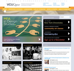
- VCU Qatar:
pop over the well-defined edge of the main frame of content

Solution: Remove the gray background and the background from behind the navigation bar so that the ribbon effect is more visible. This will add more white space and also make the layout seem less boxy.
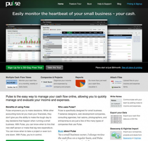
- Pulse App:
pop over the well-defined edge of the main frame of content
 Solution: Move the middle image in the row of hero images down slightly so that it is not aligned with the other two at the bottom
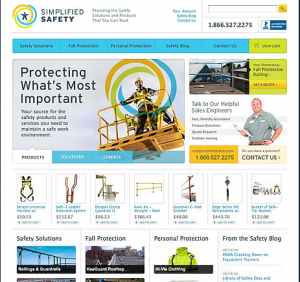
- Simplified Safety:
Use a badge, sticker, banner or ribbon to break the grid
 Solution: Un-crop the circle graphics behind the construction worker so that the break out of the box.
