What is special about the navigation? Two kinds of navigation, paralax scrolling on individual pages as well as links from page to page
What is good about it? Changes from no background to colored background as you scroll down.
What is a possible drawback or caveat to using this navigation? Too much and confusing to have two types of navigation
What is special about the navigation? Navigation default state is hidden on left side (like mobile device)
What is good about it? Clean, simple
What is a possible drawback or caveat to using this navigation? Hidden. Hard to find unless user is tech savvy and is familiar with the icon that indicates “menu”. Also, each time you click, icon becomes hidden again.
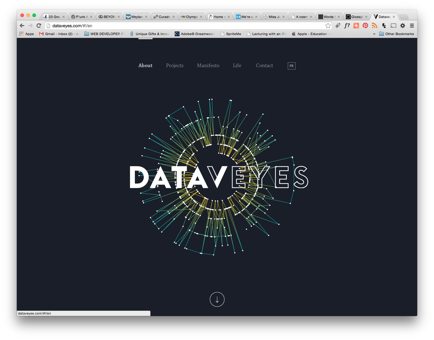
What is special about the navigation? When user hovers on navigation link, the entire navigation shifts down. The active page is bold and has a bar above it to indicate the page the user is on.
What is good about it? Located at top. Easy to see
What is a possible drawback or caveat to using this navigation? The hover/shifting animation gets old quickly.
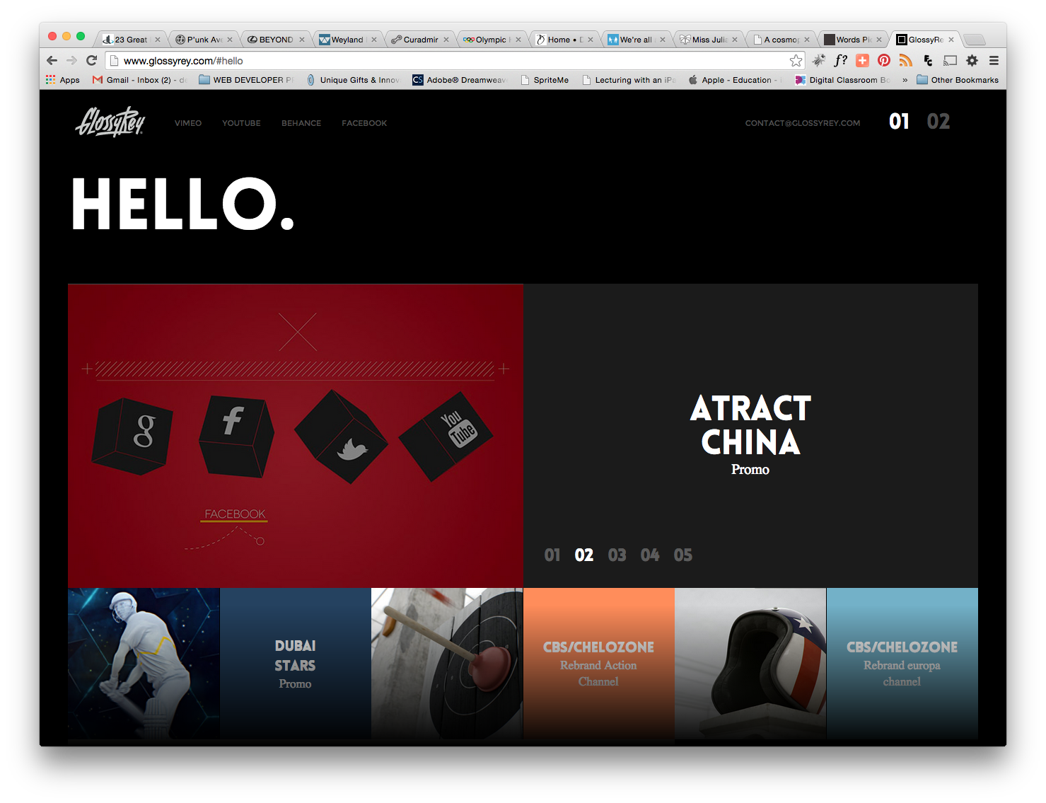
http://www.glossyrey.com/#hello
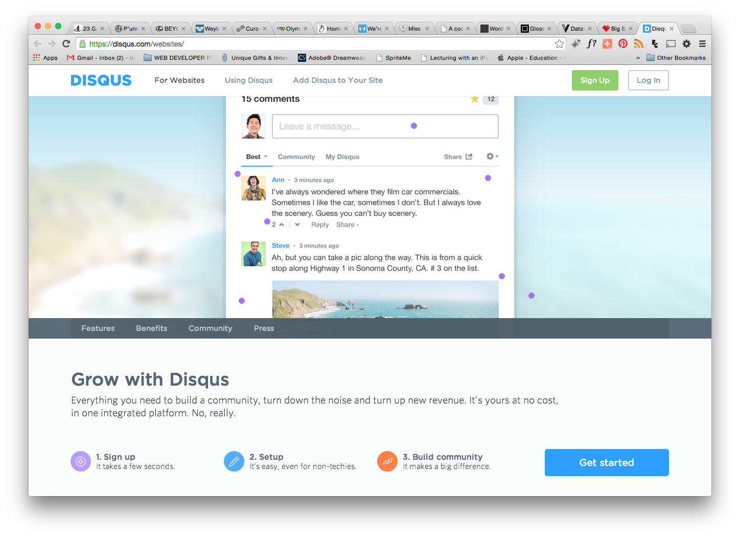
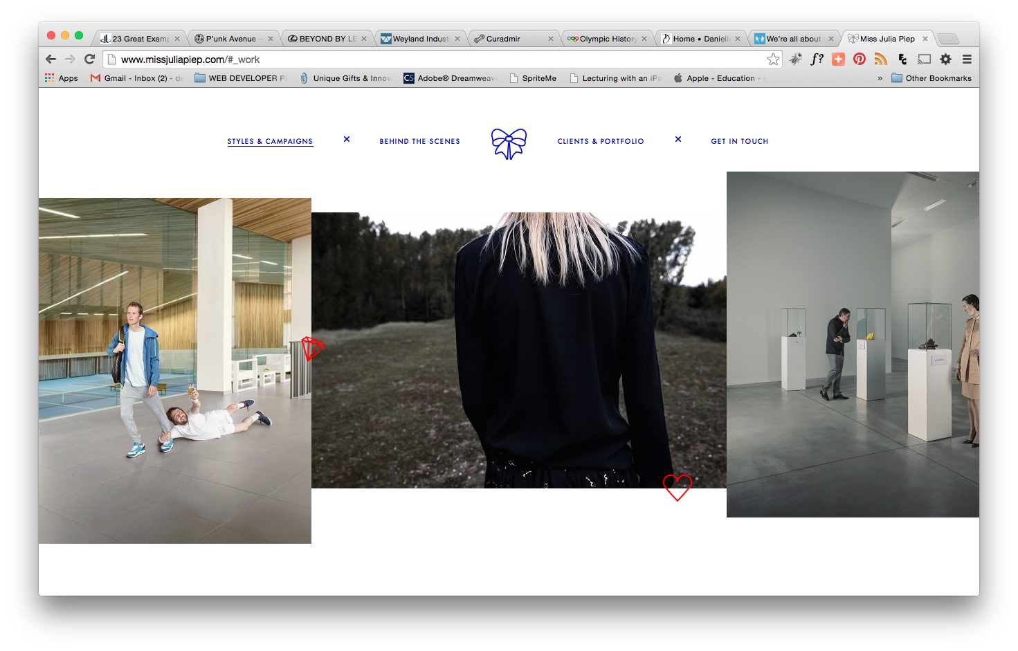
What is special about the navigation? Social media looks like a nav bar top left instead of icons. Navigation is top right, starts with contact email and consists of 2 numbers. Once clicked, scrolls to location on same page.
What is good about it? Located at top; simple; parallax scrolling, clean
What is a possible drawback or caveat to using this navigation? Not what a user might expect. (Not intuitive).
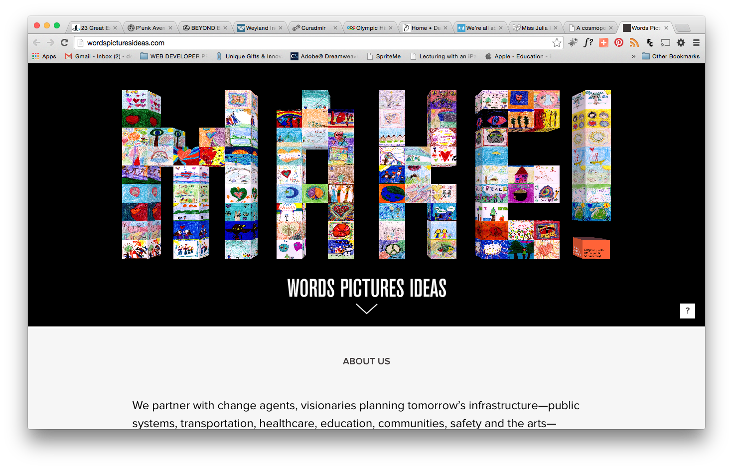
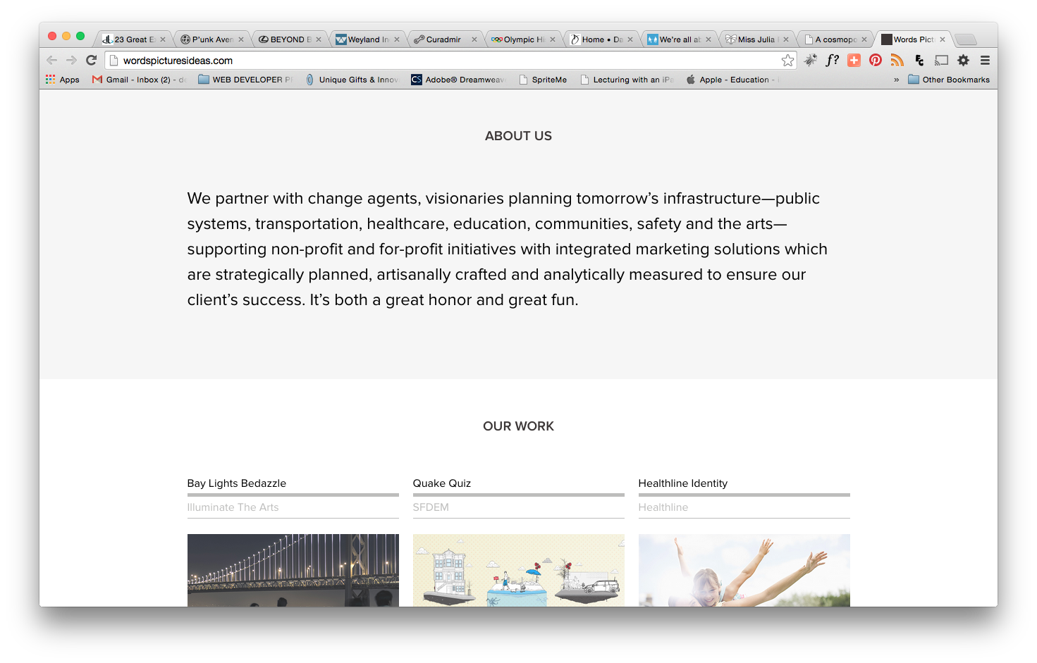
http://wordspicturesideas.com/
What is special about the navigation? One arrow below the hero image
What is good about it? Simple. The arrow indicates something will happen if you click the arrow. Parallax scrolling
What is a possible drawback or caveat to using this navigation? After the arrow is clicked and the page scrolls to the “about” section, there are no other navigation buttons or links available to move through the site.
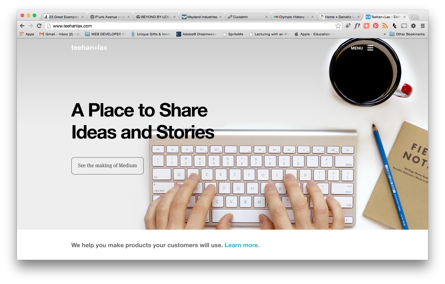
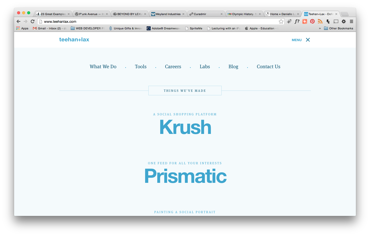
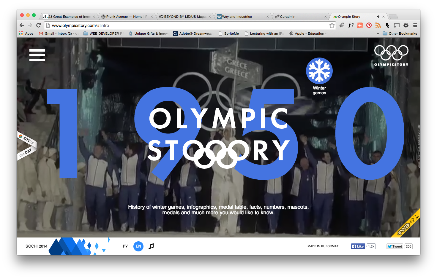
What is special about the navigation? Parallax scrolling vertically and horizontally
What is good about it? Located at top; simple; parallax scrolling, clean, intuitive
What is a possible drawback or caveat to using this navigation? Animation overkill
What is special about the navigation? Very simple, parallax animation
What is good about it? Starts below hero image on home page, moves to top after it is clicked simple; clean, intuitive
What is a possible drawback or caveat to using this navigation? Looks like the site uses parallax scrolling on the same page but it is actually a transition from page to page.
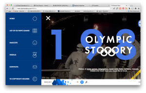
What is special about the navigation? Navigation default state is hidden on top right side (like mobile device). The word menu is to the left of the icon
What is good about it? Clean, simple, out of the way
What is a possible drawback or caveat to using this navigation? Hidden. Each time you click, icon becomes hidden again which can be annoying. Would be better if user has choice to keep it open.
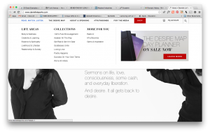
http://www.daniellelaporte.com/
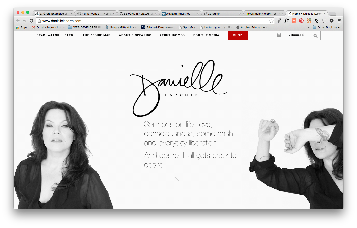
What is special about the navigation? Parallax scrolling vertically and horizontally
What is good about it? Located at top; parallax scrolling, clean, intuitive
What is a possible drawback or caveat to using this navigation? Confusing. On hover, more link options. User expects parallax scrolling on home page. Info on home page easily overlooked.
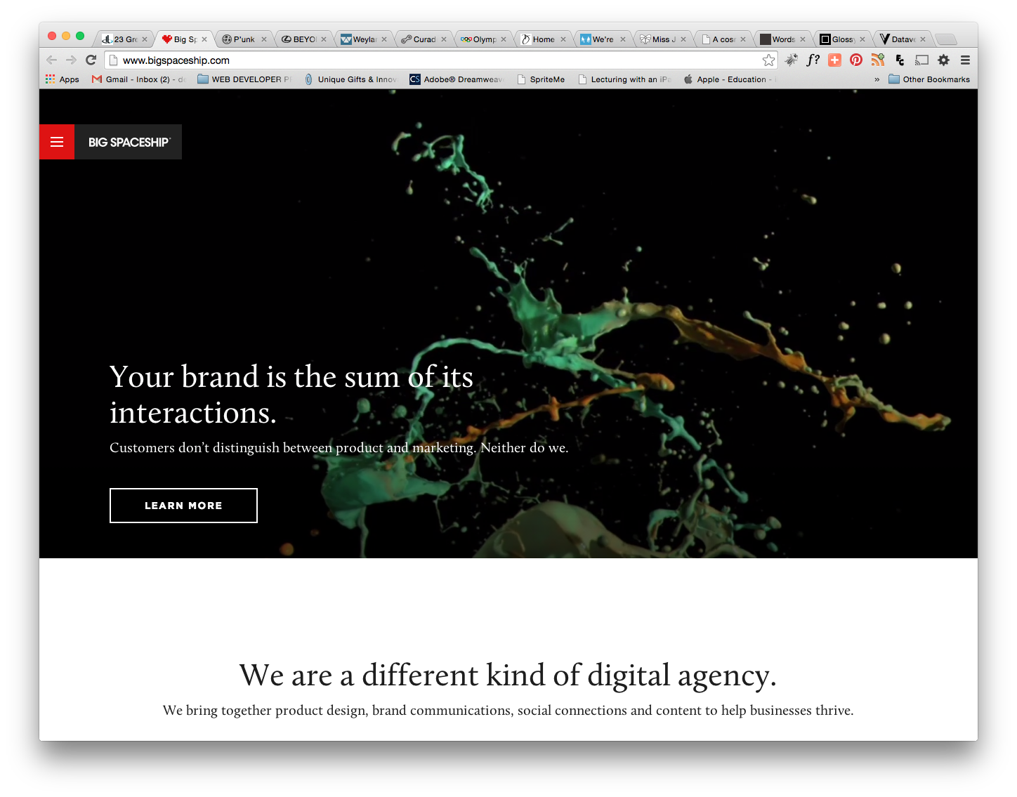
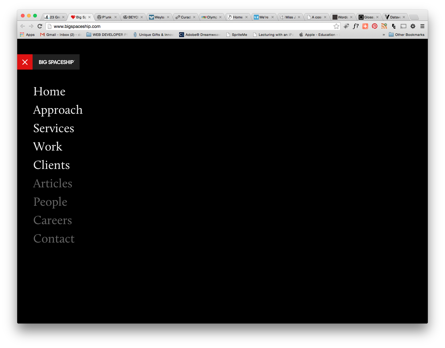
What is special about the navigation? Navigation default state is hidden on top left side (like mobile device).
What is good about it? Located at top. Out of way.
What is a possible drawback or caveat to using this navigation? Hidden. Hard to find unless user is tech savvy and is familiar with the icon that indicates “menu”. Also, each time you click, icon becomes hidden again. The animation gets old quickly.
Which navigation style or concept in the article would, in your opinion, work nicely for the http://ftwebdesign.com/ website? Punkave.com uses a nice clean navigation. It is intuitive and clean. On hover, there is a nice transition between buttons.