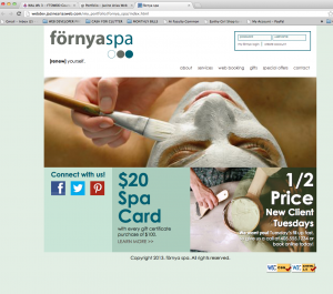
Förnya is the swedish word for renew. I chose it because reflects what a person wants to do when they go to the spa and how they feel afterwards. Using a foreign word in the name gives the salon a European upscale feel.
Situation Analysis:
For my research, I looked for day spas in New York, Chicago, Oklahoma City and Dallas. I looked at the sites for spas that received high reviews and recommendation. I was extremely surprised to find that the majority of the websites for these existing upscale day spas were poorly designed and do not accurately reflect the image or reputation of said spas.
The primary goal is too create a site that reflects the kind of experience a client would have at the spa. This will be achieved through supporting images and marketing copy.
Target Audience:
Förnya is an upscale day spa, which caters primarily to mid to upper income health conscious women who want to rejuvenate and maintain their skin through facials and full-body skin treatments.
FOCUS STATEMENT
The purpose of the website is to promote förnya as a premier day spa that specializes in all-natural facials and full-body skin treatments. The site will increase traffic to the spa through online booking and special promotions such as “New Client Tuesdays.”
MOOD BOARD
Images: I looked at images of existing upscale spas and salons. They all have a similar look and feel; an earth tone neutral color palette, clean lines, spacious and serene.
Color swatches: I collected images of the beach, tropical forests, and bamboo for a richer color palette that includes greens and blues.
Typefaces:. Clean and modern. San serif or slab serif. Century Gothic, Museo Slab, Caviar Dreams
http://pinterest.com/designqueen928/pamper-yourself/
LOOK AND FEEL CONCEPT
Clean, blissful, calm, relaxing, refreshing, serenity now.
I went with a blue, green and sand color palette inspired by an image of a beach. Blues and greens are calming colors, which, reflect the atmosphere a client would experience at the spa. The home page is clean and not copy heavy to reflect the idea of serenity and relaxation.
The wide screen format of the image on the home page would actually be a slide show of several images that would change with a fade in/out transition. The images would be of clients receiving different treatments and enjoying their experience at the spa.
WIRE FRAME