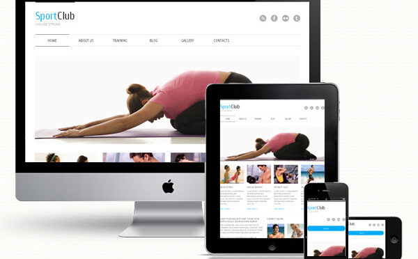
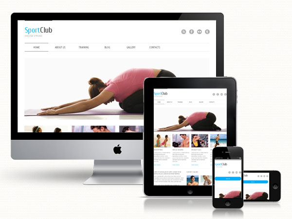
Responsive design is “the practice of creating digital experiences that adapt to seamlessly deliver content suited to the device context of the user’s operating system, screen size, or orientation.” According to International Data Corporation (IDC) by 2015, there will be more users accessing the internet via mobile devices than through PCs. The implications of this trend are significant for web designers. As the use of mobile device continues to grow, designers must present their sites in a way that looks good on a smart phones as well as a large 27-inch monitor.
Responsive design has transitioned from “nice-to-have” to a “must-have”. As quickly as mobile devices are evolving, it would simply not be feasible to design custom sites exclusively for each individual device as they emerge as well as maintain older versions. A responsive website can adapt to new screen resolutions as well as new devices, “one site, one content base, and one code-base.” (Stakem, Roux, Holland). There is somewhat of a misconception that using a fluid grid will replicate the site at every resolution the exact same way. In an ideal world, this would be possible but in reality it doesn’t work this way. In the article, “What Responsive Design is Not,” Jeff Orloff says, “To fit everything you see on that nice big monitor onto the screen of a smartphone, something’s got to give – and that’s content. When a site is displayed on a smaller screen there are times when certain content is hidden so that things fit.” In other words, adjustments have to be made, which is where CSS comes in. As Orloff puts it, CSS is the ultimate time saver. “One quick change to a color code and thousands of pages could change in how they look.” To ensure quality and consistency, however, sites should be tested for different devices.
Pete Cashmore of Mashable, recently wrote about Mashable’s makeover into a responsive website. In the article entitled, “Why 2013 is The Year Of Responsive Web Design,” he says, “Media companies like ours are seeing a major shift in the consumption habits of their audiences. Those organizations that don’t act may find themselves behind the curve…Given the rapid adoption of tablets and smartphones — and the fact that users currently seem to prefer reading their news on the mobile web rather than in apps — I think it’s inevitable that 2013 will be the year that responsive design takes off. For publishers, it offers the simplest way to reach readers across multiple devices. For users, it ensures a great experience on every screen.”
5 Great Resources for Creating Responsive Design
If you’re new to responsive design here are some helpful resources to help you get started
Beginner’s Guide to Responsive Web Design
Whether you’re a beginner or a seasoned web professional, creating responsive designs can be confusing at first, mostly because of the radical change in thinking that’s required. As time goes on, responsive web design is drifting away from the pool of passing fads and rapidly entering the realm of standard practice.
http://blog.teamtreehouse.com/beginners-guide-to-responsive-web-design
This is Responsive
Patterns, resources and news for creating responsive web experiences.
http://bradfrost.github.com/this-is-responsive/
10 basic tips about responsive design
Ui Design Guidelines For Responsive Design
Some UI guidelines and tips to consider when designing a website to make it cross-device friendly and responsive.
http://tympanus.net/codrops/2013/01/21/ui-design-guidelines-for-responsive-design/
50 fantastic tools for responsive web design
To get started with building a responsive site, having a strong toolkit can make a world of difference. Here Denise Jacobs and Peter Gasston round up 50 great tools to aid the process of making your sites responsive
http://www.netmagazine.com/features/50-fantastic-tools-responsive-web-design
Work Cited:
Cashmore, Pete. “Mashable.” Mashable. Mashable, Inc., 11 Dec. 2012. Web. 12 Mar. 2013.< http://mashable.com/2012/12/11/responsive-web-design/>
International Data Corporation. IDC: More Mobile Internet Users Than Wireline Users in the U.S. by 2015. IDC: More Mobile Internet Users Than Wireline Users in the U.S. by 2015. IDC- Article Not Found. IDC Corporate USA, 12 Sept. 2011. Web. 12 Mar. 2013. http://www.idc.com/getdoc.jsp?containerId=prUS23028711#.UT1bFFpATYg
Orloff, Jeff. “What Responsive Design Is Not.” Webdesigner Depot RSS. Webdesigner Depot, 4 Jan. 2013. Web. 12 Mar. 2013. <http://www.webdesignerdepot.com/2013/01/what-responsive-design-is-not/>
Stakem, Kevin, Lindy Roux, and Matt Holland. “A Primer on Responsive Design : From Content to Development.” A Primer on Responsive Design. UX Magazine, 12 June 2012. Web. 10 Mar. 2013.< http://uxmag.com/articles/a-primer-on-responsive-design>